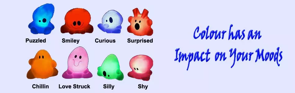
When choosing colour for decoration, always remember that each colour has an emotional reaction. How do these colours make you feel? These colours can make you feel anything from being peaceful to being frustrated. So it is important to select your colours wisely when you’re trying to achieve harmony in your home.
When selecting a color, consider the mood of a room. In a bedroom, do you want the feeling to be restful and soothing or dramatic and intimate? Soft, cool colors and neutrals usually create a quieter feeling while stronger colors are for drama.
Do you want a dining area to feel sociable and stimulating or appear formal and quiet? Warmer, contrasting and somewhat brighter colors add to a sociable atmosphere; deeper blue-greens and neutrals will give a more formal ambiance.
Do you want kids’ rooms to create an active and exciting energy or an orderly and restful feeling? Be careful not to over stimulate your children with intensely bright hues. You may not know it, but some brighter colors can lead to unrest and irritability.
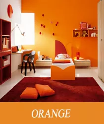
Orange is the color associated with autumn tinged forests and harvested crops, and we therefore associate it with ripe produce, healthy foods, and eating. Its no wonder why Orange both awakens and stimulates our appetites. Oranges are warm, welcoming, and vital. Melon, tangerine, and yellow-orange mango are bright, cheerful, and tend to improve appetite. When used in kitchens, breakfast nooks, and dining rooms, orange shades can be very comfortable.
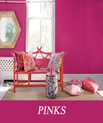
Pink is essentially a light red and is usually associated with love and romance. Pink is an interesting color because it has the cultural associations of being feminine. Pink generally is a comfort color and is favored by many for its sweet, child-like appeal. It´s a good choice for a young child´s room: young girls often like pink and lavender combinations.
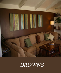
Brown can create a somber and dull feeling, but when combined with the right furniture, it can make a room look bold and masculine, which is why this color is a popular choice for painting a guy’s room. The popular shades of brown are chocolate and beige.
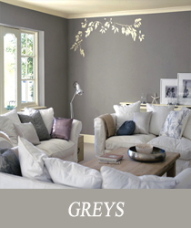
Grey tends to enhance creativity, which makes it a good color for offices and studios. Grey is also favored as an executive color. As a neutral, grey provides an unobtrusive background for an infinite number of color combinations. Greys on walls are often very liveable for a long while, provide a flexible neutral background for furnishings, and can be extremely stylish. Greys can be buttoned down and traditional, modern and contemporary, or beach house friendly.
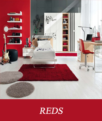
Red is a bold color to use and it is widely heralded as the color of passion. The most popular shade of red is pink. Other popular shades of red are burgundy and melon red. The color is best suited for painting living rooms. However, if you are using a dark shade of red to paint the walls, use light colored furniture for decorating the room. You can also combine red with other colors like yellow, blue and white.
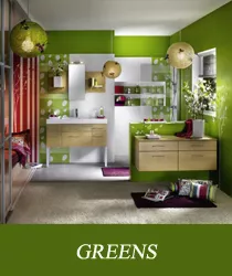
Green is not so widely used for interior painting, but occasionally, kitchen or living rooms are painted in this color. Green symbolizes nature and creates a mood of balance and harmony. Combine green with colors like yellow, white and gray to make the room more attractive.
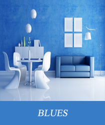
Blue is a popular color for painting interiors and is suitable for all rooms, especially the bedrooms and bathrooms. Blue gives a calm and cool mood to a room. The popular shades of blue are aqua, turquoise and sky blue.
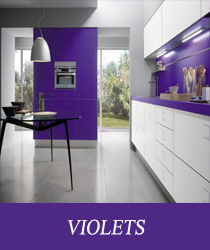
Violet is synonymous with royalty, style, and sophistication. This color has been a popular choice for painting girls’ rooms. However, in recent times people have started to use the color to paint contemporary kitchens. As a shade of purple, lavender can be used to paint kitchen walls and accentuated by black appliances. Steel furniture can also be used to make the kitchen appear more stylish.
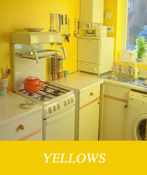
Yellow is another popular choice when it comes to interior painting. This color is great for painting kids’ rooms as it creates a sunshiny, bright, and cheerful feeling. You can combine it with almost any color, but the colors that complement it best, are red and blue.